
You've carefully crafted a design scheme that reflects your hotel's unique theme or location, drawing inspiration from a wide tapestry of sources. Whether it's the local culture, natural surroundings, or a particular aesthetic, your vision is a reflection of what makes your property stand out.
Creating a luxury hotel interior that differentiates itself is more important than ever. Guests are seeking memorable experiences, and your color design plays a significant role in making their stay unforgettable. By thoughtfully curating your hotel's atmosphere, you're guaranteeing it leaves a lasting impression and stands apart in the hospitality industry.
What Colors Work Best For Luxury Hotel Interiors?
First things first, it’s important to remember when you’re designing a space, warm, neutral colors create a sense of comfort, elegance, and sophistication. These hues can serve as a calming backdrop for a luxury hotel interior, inviting guests to relax and unwind. However, to prevent the design from becoming too monotonous, a bold twist can add visual interest and personality.
When designing hotel interiors, one place to focus on distinction and personalization is the guest room. A typical place to retreat, the guest room can be a space to experiment with different paint colors and patterns to come up with a color and design that makes sense for your brand (and target market); color is also one of the most visible elements of luxury hotel interior design.
1. Warm Earthy Tones & Neutrals
Warm earthy tones and neutrals are making a strong impact in design, featuring grounding shades like green, blue, brown, and cream.These colors align with the growing botanical resurgence, bringing a fresh, nature-inspired ambiance.
Neutrals such as beige, taupe, warm grays, and rich browns—think coffee, cappuccino, and lattes—enhance biophilic designs, a trend that mimics nature to foster a deeper connection to the environment.
Incorporating natural materials like wood, stone, leather, and wool, these warm, grounded palettes create inviting spaces that reflect the beauty and calm of the outdoors.
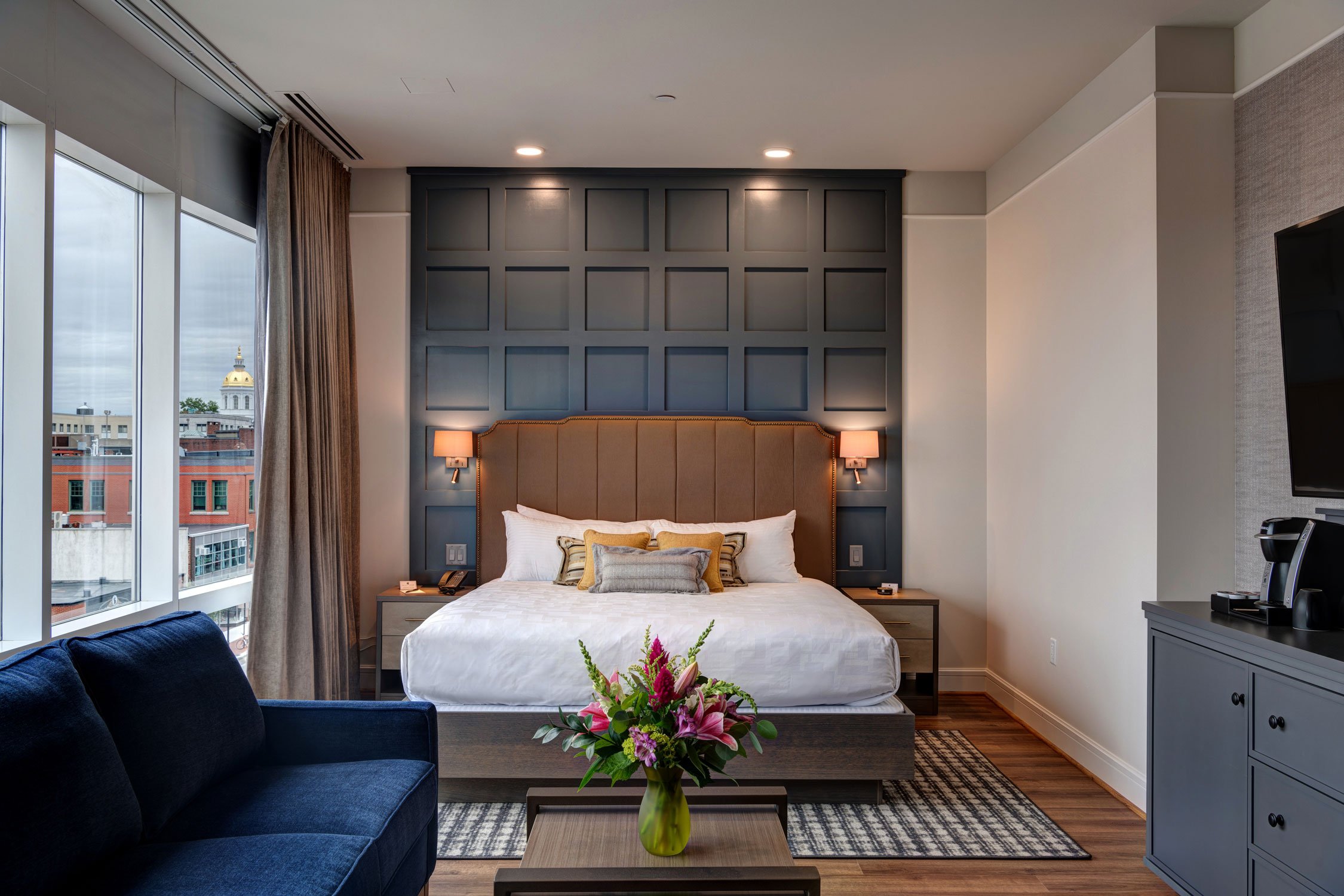
(Source: The Hotel Concord, Concord, NH)
2. Pinks and Peachy Tones
Pinks and peachy tones are gaining popularity in design, offering a warm and grounding presence that creates calming, comforting spaces. These trending hues, from soft blushes to deeper peach, evoke a sense of serenity while adding a touch of color that remains subtle yet impactful.
Ideal for creating inviting environments, these shades bring warmth without overwhelming the senses. Their versatility allows them to blend seamlessly into various design styles, whether modern, traditional, or eclectic.
Paired with natural textures and materials, these pink and peach tones can elevate the coziness of a room, making it feel both soothing and visually engaging. Perfect for those looking to create balanced, serene interiors with a hint of warmth and elegance.

(Source: Your Home Style)
3. Vibrant Reds, Yellows and Bold Mid-Blues
Vibrant reds, cheerful yellows, and bold mid-blues are making waves in design as the new "happy colors." These lively shades bring a burst of positive energy and optimism to any space, transforming interiors with their bright and uplifting presence.
(Source: FORMA Collection, Boutique Design New York 2018)
When paired with natural, grounding earth tones, these vibrant hues create a striking contrast that feels both fresh and fun. This combination reflects a renewed desire for joy and vibrancy in our living environments.
Whether used in subtle accents or as bold statements, these colors infuse rooms with warmth, enthusiasm, and a playful spirit. They not only boost the aesthetic appeal of a space but also contribute to a more invigorating and balanced atmosphere, making any room feel more dynamic and inviting.
Changing Trends of Luxury Hotel Interior Design
Trends evolve over time, and luxury hotel interior design is no different.
While blue, green, and yellow still play a role in hotel design, the trend has shifted towards softer, muted tones that evoke a calming, nature-inspired atmosphere. These colors haven't disappeared entirely, but their use has evolved, blending with a broader palette of earthy shades. The focus now is on creating spaces that reflect tranquility, wellness, and sustainability.
Those three colors are still relevant but have shifted to softer, more muted tones that match contemporary design trends. Instead of the bold, vibrant colors of popular during the last decade, hotel designers are now opting for more subdued shades of blue, green and yellow:
|
Blue: Slate blue, dusty blue, steel blue, soft denim, powder blue |
|
Green: Sage green, olive green, moss green, pistachio, forest green |
|
Yellow: mustard, ochre, and warm, earthy golds |
This shift in color trends didn’t happen out of the blue. It reflects a broader evolution in design preferences:
- Biophilic Design Influence: Earthy tones, such as terracotta, sage, and soft neutrals, are increasingly popular due to the growing influence of biophilic design. These colors are seen as more calming and grounding, aligning with the trend of incorporating nature into interior spaces.
- Desire for Timelessness: There is a stronger preference for timeless and understated colors. Soft, muted versions of blue and green, such as slate or moss, are favored over bold and bright tones. This shift helps create serene and enduring environments that won't feel dated quickly.
- Wellness and Calm: The post-pandemic focus on wellness and mental health has influenced the design landscape. Colors associated with calmness and relaxation, like soft blues and greens, are trending, but in more subdued, pastel forms, rather than the vibrant hues seen in 2019.
- Eco-friendly Aesthetic: Natural, sustainable materials and colors that evoke a sense of environmental consciousness, like organic greens and warm neutral shades, align with the eco-friendly focus in hotel design.
Luxury Hotel Interior Q&AHow can a hotel's location or surrounding environment influence its color palette choices? The surrounding environment and local culture are key factors when selecting a color palette for a hotel. If a property is located in a coastal area, colors like soft blues, sandy neutrals, and seafoam greens might be used to reflect the natural landscape. In contrast, a hotel in an urban setting could draw from the city’s architecture or artistic culture, using bold hues like industrial grays or pops of vibrant city-inspired colors. Local culture also plays a role, as incorporating colors associated with regional traditions or heritage can make the design feel more authentic and connected to the destination. What are some practical tips for balancing bold, vibrant colors with neutral tones in a cohesive design scheme? To balance bold, vibrant colors with neutral tones, start by using neutrals as the primary foundation in larger areas like walls or floors, creating a calm and consistent base. Bold colors can then be added through accents such as cushions, artwork, or furniture, ensuring they don't overwhelm the space but instead enhance its vibrancy. To maintain cohesion, choose one or two bold shades to repeat throughout the design in different ways, avoiding too many competing colors. This approach allows the space to feel both lively and grounded without becoming chaotic. What role does lighting play in complementing the chosen color palette in luxury hotel interiors? Lighting significantly influences how colors are perceived and can help highlight or soften a hotel’s color palette. Natural light brings out the true tones of colors, making earthy neutrals and vibrant accents appear more vivid. On the other hand, artificial lighting, depending on its warmth or coolness, can either soften or intensify certain hues. For example, warm lighting emphasizes cozy, neutral tones like beige and taupe, while cooler lighting makes bold colors like blues and reds stand out. Proper lighting placement allows attention to be drawn to specific areas where color is used more boldly, creating a balanced and inviting atmosphere throughout the space. |
Incorporate Color Into Your Luxury Hotel Interior
Incorporating a diverse color palette into your luxury hotel interior can create a truly unique and inviting environment. By thoughtfully integrating these colors into accents, textiles, and different design elements, you can craft spaces that resonate with warmth, optimism, and style.
Whether aiming for a dynamic, playful atmosphere or a serene, luxurious retreat, the strategic use of color can transform your hotel into a visually stunning and emotionally engaging destination, guaranteeing every guest enjoys a memorable stay.
Ready for A Change?
If you’re renovating your hotel soon, be sure to work with your hotel furniture manufacturer sooner rather than later to get the ball rolling on design elements.
Work with a team of designers and manufacturers who can help determine what material is best to incorporate color into your strategy.

This article was recently updated to reflect current industry trends